
Cart Drawer vs Cart Page on Shopify: Which One Converts Better? (2026)

Summarize this article with AI


Cart drawer or cart page? What A/B tests and CRO research say about conversion, plus how native upsells change the answer.
Cart drawer or cart page is one of the most argued-about choices in Shopify CRO, and most of the advice you will read is confident in one direction. The honest answer is that neither wins everywhere. The real question is not which looks better, it is which helps your shoppers buy with less effort.
This guide brings together cart abandonment research, what each format does well, and what changes once you add upsells. We also say where the evidence is thin.
The short answer
- Cart drawer: best when speed and low friction matter, such as small catalogs, impulse buys and shoppers who keep browsing.
- Cart page: best when the cart needs explaining, such as higher prices, shipping rules, bundles and gifts.
- Be careful on mobile. A narrow drawer gets crowded fast: test it before rolling it out on mobile.
- Upsells decide more than the container does. A focused native upsell in whichever you pick has better evidence behind it than the drawer-versus-page choice itself.
Why the cart matters: 70% of carts never convert
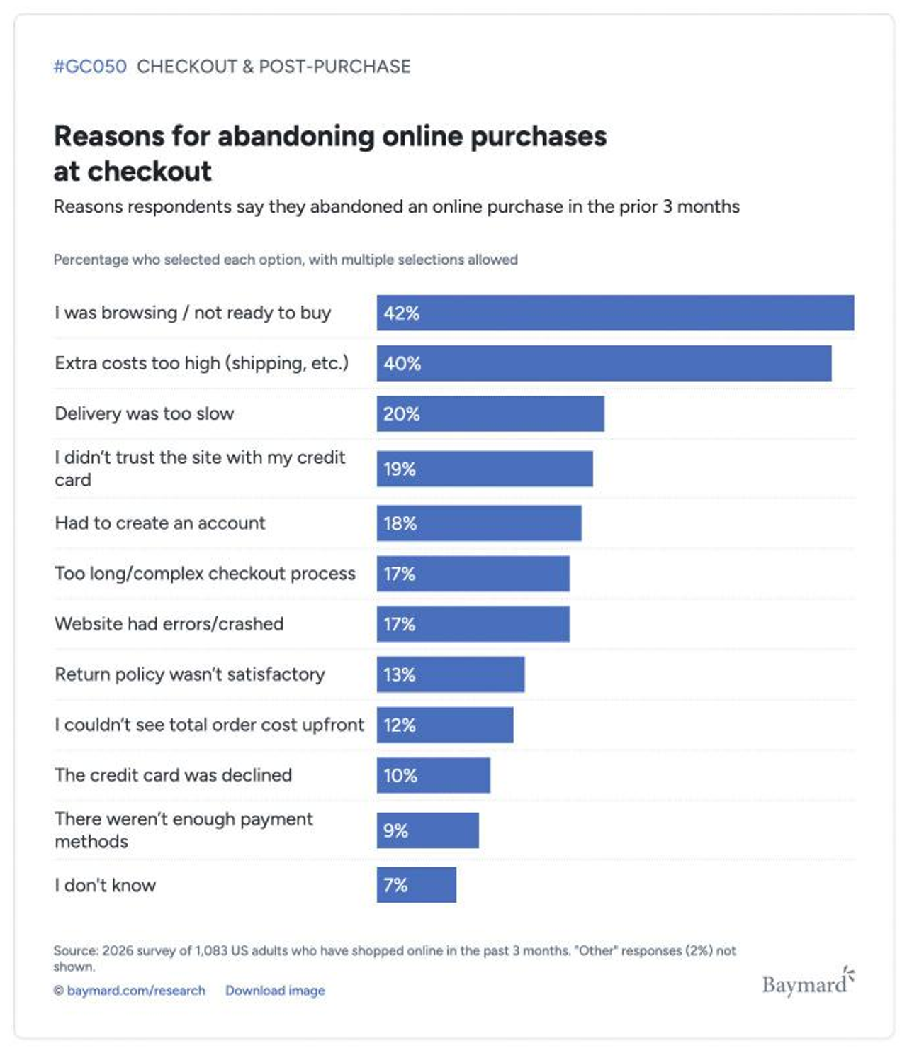
The Baymard Institute puts average cart abandonment at 70.22%, calculated from 50 studies. That figure includes people who were never going to buy, but when Baymard strips out "just browsing"(opens in a new tab), the reasons shoppers give are mostly about clarity and effort:
Reason shoppers left (excluding "just browsing") | Share of abandoners |
|---|---|
Extra costs too high (shipping, tax, fees) | 40% |
Delivery too slow | 20% |
Did not trust the site with card details | 19% |
Account creation required | 18% |
Checkout too long or complicated | 17% |
Website errors or crashes | 17% |
Could not see the total cost upfront | 12% |
Three of these are cart-design problems: surprise costs, an unclear total and a long path to payment. Baymard estimates that better checkout design alone could recover about $260 billion in orders across the US and EU, equivalent to a 35% conversion lift for an average large site. The cart sits right before that checkout, so how it shows shipping, totals and next steps is a conversion decision, not a styling one.
What each format does well
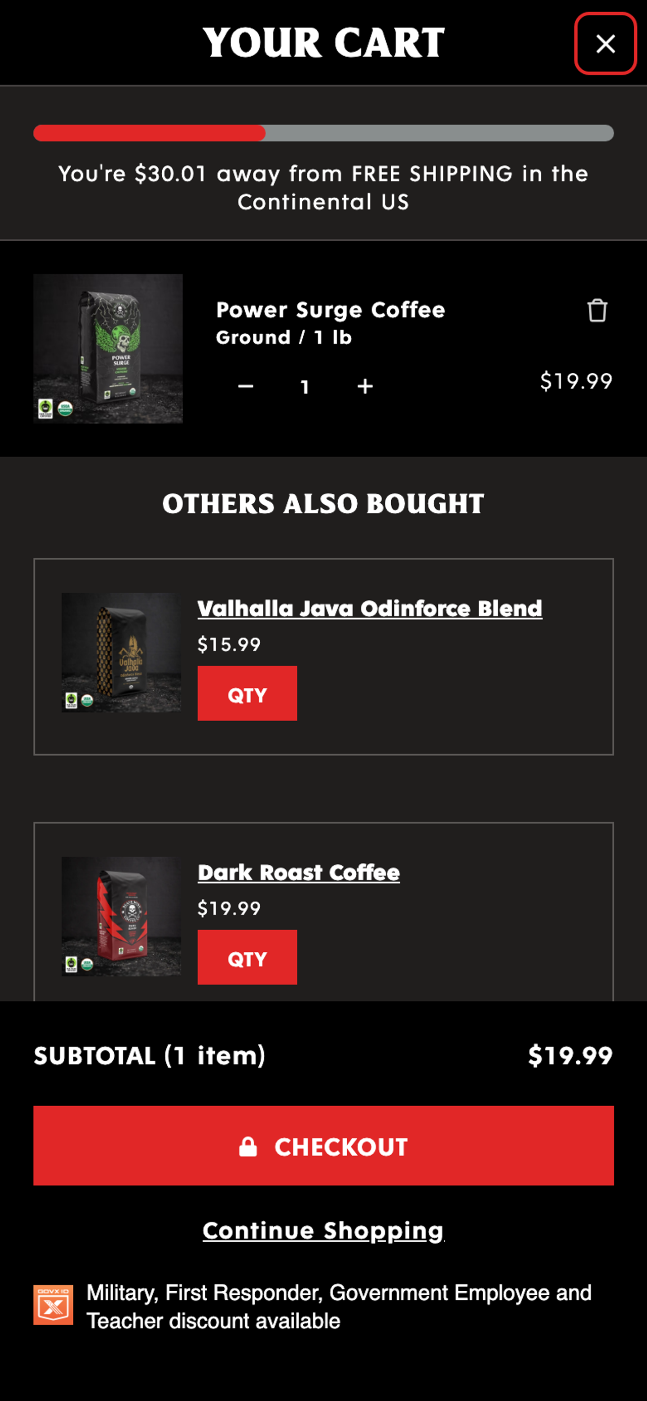
Cart drawer
- Keeps context. The shopper stays on the product or collection page, so continuing to browse costs nothing.
- Fewer steps. One less page load between add to cart and checkout.
- Cons: limited space, easy to overload with offers and messages, and it needs careful work on mobile and accessibility (focus trapping, a visible close button, scroll lock).
Cart page
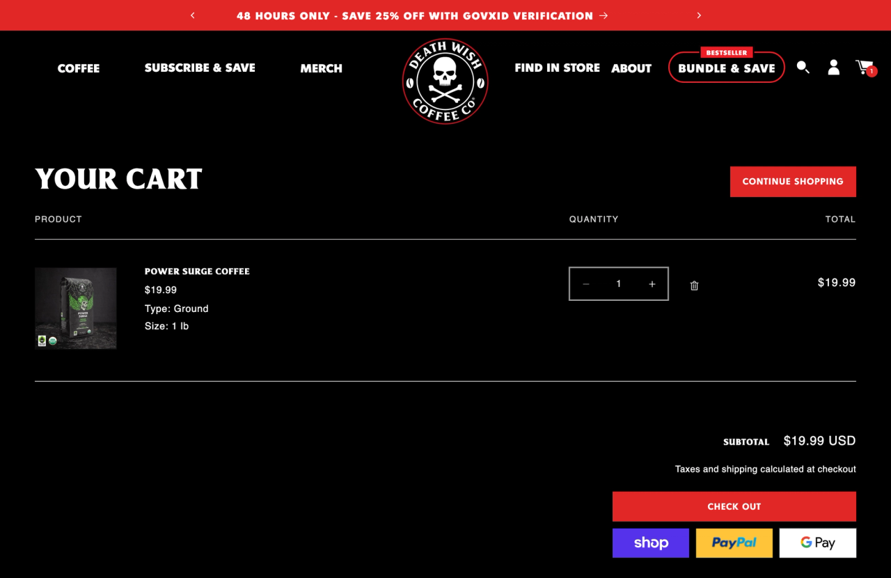
- Room to explain. Shipping estimate, totals, trust signals, a discount field and editable line items all fit.
- Better for considered purchases, where shoppers want to review before paying.
- Cons: an extra step, and a reload that interrupts browsing.
Which one should you choose?
Use this as a starting hypothesis, then test it.
Your situation | Lean towards | Why |
|---|---|---|
Few products, impulse buys, low price | Cart drawer | Speed matters most. The shopper adds, glances, pays. |
Mobile is most of your traffic | Test first, default to the page | A drawer that's too narrow makes the total and offers hard to read on a small screen. |
High price, considered purchase | Cart page | Shoppers want to review, compare and reassure themselves. |
Shipping rules, bundles, gifts or subscriptions to explain | Cart page | Space for totals, shipping estimate and trust signals. |
Big catalog, shoppers keep browsing after adding | Cart drawer | Keeping them in the flow beats a page reload. |
You rely on upsells and a free-shipping bar | Whichever you can fill cleanly | A cluttered drawer loses to a clean page, and the reverse. |
If you cannot decide, start with what your theme does well. A cart page or drawer that is fast, uncluttered and shows the total, shipping and next step clearly will beat a slick one that is not.
Upsells: what matters more than the format
The strongest published results in this area are not about the container. They are about what you put in the cart. GrowthRock's two upsell tests(opens in a new tab) are a good example:
- A furniture store added a one-click leather conditioning kit in the cart when a sofa was added. Average order value rose by $55 over 41 days and 4,000+ transactions, at 92% statistical significance. Sales of the kit went from 40 to 80 a week to 150 to 180.
- A health food brand offered a second flavour pack at $2 off in the add-to-cart drawer. Conversion rose 13.4% at 95% significance across 1,000+ order events.
Both offers were small, relevant and easy to say yes to, and neither interrupted checkout. Notice too that one ran in a cart and one in a drawer. The format did not decide the win; the offer did.
Pop-up upsells vs native upsells
A pop-up upsell asks a question in a layer on top of the cart: "Add this before you go?" A native upsell is part of the cart itself, a slider or a block in the same layout as the line items.
- Native upsells do not interrupt the shopper, load no extra widget, and match your theme's fonts and colours without custom CSS. They also cost nothing in script weight if they use Shopify's own product recommendations.
- Pop-ups can suit a high-ticket upgrade, but they add a step to the exact moment a shopper is closest to paying, and each one is a chance to close the tab.
We found no controlled test that compares the two directly. Numbers you see comparing "pop-up versus in-cart acceptance rate" mostly come from upsell app vendors. Our view, as theme developers, is to start native and add a pop-up only for an offer big enough to justify the interruption.
How native upsells work in Pops
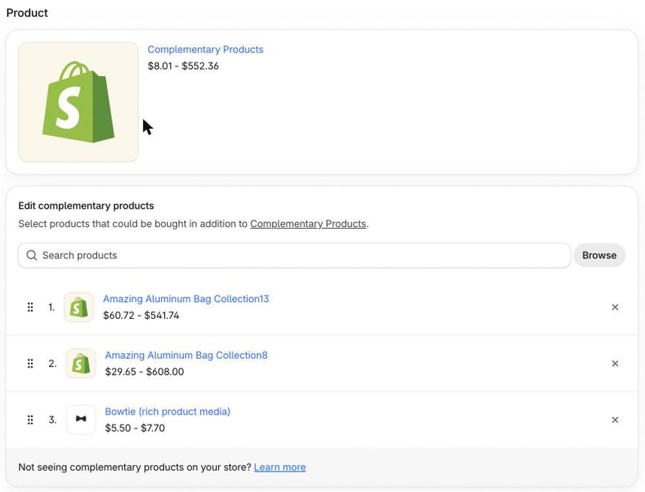
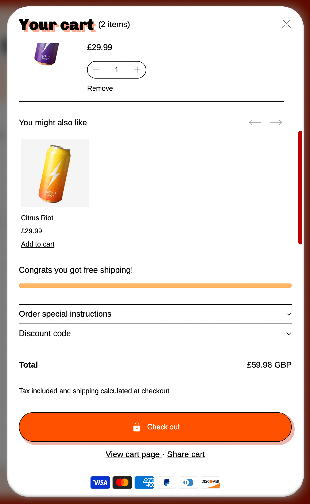
In the Pops theme, the cart upsell is a theme block, not an app. There is one upsell slider for the cart drawer and another for the cart page, and both read Shopify's own product recommendations for what is in the cart:
- Related products are chosen by Shopify automatically.
- Complementary products are the pairings you set in Shopify's free Search & Discovery app.
- You choose how many products to show and the image ratio, and can hide the block on mobile or desktop.
Because the drawer and the page have separate blocks, you can run a short slider in a tight mobile drawer and a longer one on the cart page. Pair it with a free shipping progress bar and you cover two of the most common cart levers without an extra app. For more on this approach, see how to increase average order value without an upsell app.
If you want offers beyond recommendations, such as quantity breaks, bundles, product add-ons or a post-purchase upsell, that is what Snap Bundle is for, and it works with either cart format.
How to test it on your own store
- Pick one metric. Revenue per session. Conversion rate alone can rise while average order value falls.
- Split by device. Read desktop and mobile separately before you ship anything.
- Run it long enough. At least two full weekly cycles and several thousand transactions. Avoid sales periods.
- Change one thing. Test drawer versus page first, then upsell versus no upsell. Not both at once.
- Watch guardrails: checkout start rate, discount-code use and page speed.
Verdict
There is no universal winner. A drawer wins on speed for small catalogs and impulse buys. A cart page wins on clarity for higher prices and more explaining. On mobile, test before you commit. And whichever you pick, a small, relevant, native upsell has better evidence behind it than the container does.
Want to see native cart upsells in action? Look at the Pops theme and try its drawer and cart page side by side in the theme editor. Want offers beyond recommendations? Install Snap Bundle and add quantity breaks, bundles and add-ons on top.
FAQ
Is a cart drawer better than a cart page for conversion?
Not as a rule. A drawer wins on speed for small catalogs, a cart page wins on clarity for considered purchases. The answer depends on your catalog, average order value and device split, so test it on your own store.
Can I use a cart drawer and a cart page together?
Yes, and many stores do: the drawer opens after add to cart for speed, and a "View cart" link leads to a full page for shoppers who want more detail. Keep the upsell blocks consistent between the two.
Do cart upsells hurt conversion?
Not when they are relevant and few. The tests we found put one or two focused offers in the cart and saw average order value or conversion go up. Stacking several offers, banners and pop-ups is what creates friction.
Native upsell or pop-up upsell?
Native upsells sit inside the cart layout, so they do not interrupt the shopper or add a script that competes with your theme. Pop-ups can work for a high-ticket offer, but they add a step. We found no controlled test comparing the two, so run your own.
How long should I run a cart A/B test?
Long enough to cover at least two full weekly cycles and to collect a few thousand transactions. Judge revenue per session, not conversion rate alone, and read desktop and mobile separately.
Does the Pops theme have a cart drawer and a cart page?
Yes. Pops ships a cart drawer and a cart page, and the upsell slider is a separate block for each, so you can show a different heading or number of products in either.

Keep reading

Shopify Search Optimization: Turn Searchers Into Buyers
How Shopify search works, how to set up the free Search & Discovery app, fix zero-result queries and decide when a paid search app is worth it.

How to Increase ROAS From Your Store, Not Your Ad Account
ROAS = conversion rate × AOV ÷ CPC. Here is how to raise the store side of that formula, landing pages, bundles, checkout, email and LTV, with worked numbers.

How to Reduce Cart Abandonment on Shopify: 12 On-Site Fixes
Seven in ten carts are abandoned. Here is how to measure your rate in Shopify, why shoppers leave, and 12 cart and checkout fixes that keep more of them.