
Hide a section on mobile or desktop in Shopify
Show a section or block only on mobile, or only on desktop, with one checkbox.
Available in
The problem
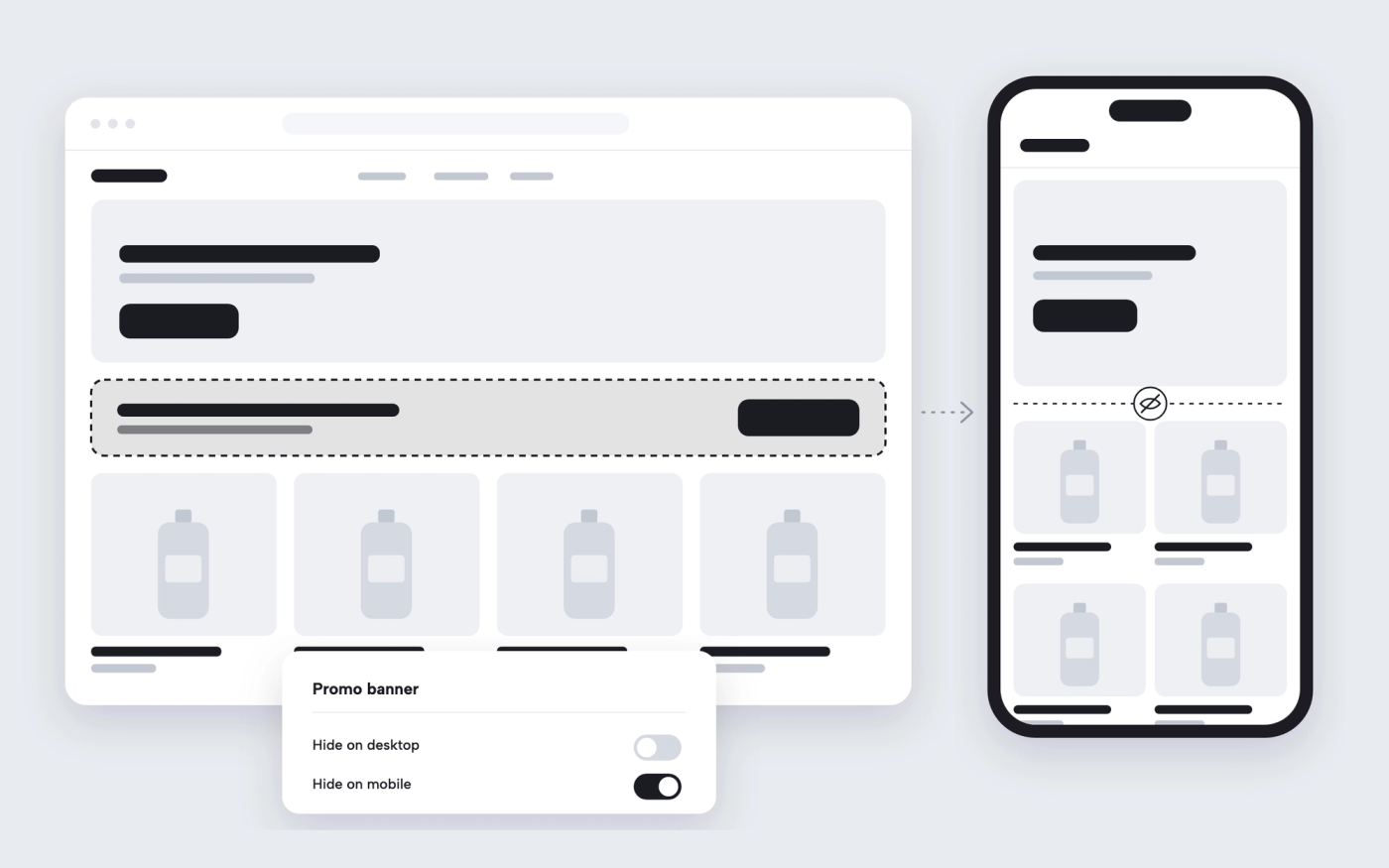
A wide banner that works on desktop can push the products far down on a phone, and a mobile-only message clutters the desktop page. Most themes show every section on every screen, so the fix is custom CSS or a duplicate template.
The solution
Pops adds “Hide on mobile” and “Hide on desktop” settings to its sections and to most of its blocks. Tick one and that section or block disappears on that screen size. You can build a desktop version and a mobile version of the same banner on one page, each hidden on the other screen.
How it works
-
Select the section or block
In the theme editor, click the section or block you want to show on one screen size only.
-
Tick Hide on mobile or Hide on desktop
The settings are at the bottom of the section or block settings.
-
Check both views
Switch the editor preview between desktop and mobile to see the result.
Questions merchants ask
Does hiding a section make the page load faster on mobile?
No. The section is hidden with CSS, so it is still in the page code. Use it to change what shoppers see, not to remove heavy content.
Can I hide a single block instead of the whole section?
Yes. Most Pops blocks, such as buttons, images and text, have the same two settings.
Related features
 Saves €6/month
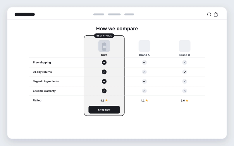
Shopify theme with a comparison table section
Compare your product with the alternatives, row by row, with ticks and crosses.
 Saves €3/month
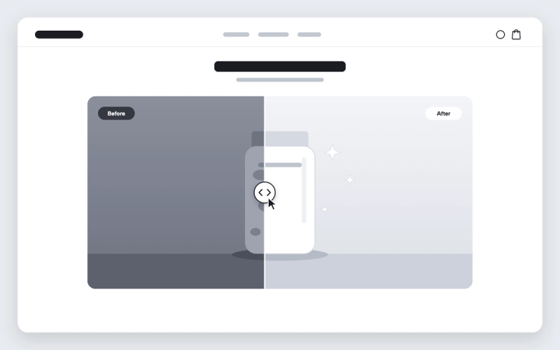
Before and after image slider for Shopify
Shoppers drag a divider across two images to see the difference your product makes.
 Saves €17/month
Instagram-style stories for Shopify
Round story bubbles that open a viewer of image and video slides, like on Instagram.
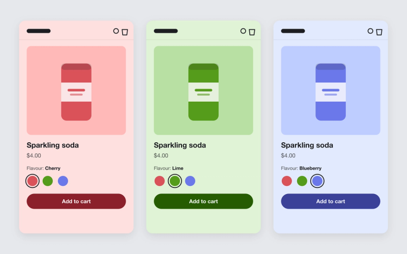
Shopify theme that changes the product page background color per variant
Give each variant a color. When a shopper picks another flavour or shade, the whole product page takes on that color.

Shopify theme that uses OKLCH colors
Pops turns every color in your color schemes into OKLCH, so one hue change recolors the store and contrast stays where you set it.

Shopify blog post template built from blocks
Lay out your blog posts with blocks: tables, sliders, accordions, newsletter forms and more, around the article text.